
Trading stocks and Bitcoin is all the rage these days, so I thought I would put together a series of educational posts to help people learn to make better trading decisions.
This particular post is for anyone who is truly new to trading.
Let’s get to it!
Classical chart analysis involves the analysis of the typical price chart that plots price on the vertical axis (y axis) and the passage of time on the horizontal, or x axis.
The typical price bar indicates the low price of the day (low end of the bar), high price of the day (high end of the bar), the opening price (left tic on the bar) and the closing price (right tic on the bar).
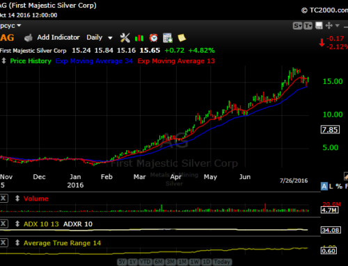
The typical chart looks like this one below…

This is a daily chart of Soybean oil futures. On the vertical axes, we see the price of the market. On the bottom is each trading day. For each trading day, a new price bar is plotted.
One other piece of information that is also typically included is the daily volume.

On this chart, we see above the date at the bottom of the chart a vertical line, along with different figures on each of the vertical axes.
These bars represent the number of contracts traded each day in this Soybean Oil market. A chart of a stock would show the number of shares traded.
We could also chart weekly, monthly, or even yearly prices in an effort to identify even longer term trends in the markets we are following.
Many traders like to analyze markets in multiple time frames in an effort to improve their odds for success.

This is a weekly chart of Soybean Oil prices covering a period of 18 months.
While the near term daily chart suggested an overall up trend, this weekly chart might suggest otherwise since prices are still below their one year highs.
That brings us to our next topic…what exactly is a trend?
How to define a trend
The very basic definition of trend is “the general direction in which something is changing or developing.”
Unfortunately, that definition doesn’t do much good for our purposes. So, with that in mind, the individual trader really needs to determine how to define a trend in their own eyes.
Some traders will use a moving average or a pair of moving averages to define a trend.
For example, if a market is trading above the 200 day moving average, and the slope of the average is up, then the trend is up.
If the market is trading below the 200 day moving average, and the slope of the average is down, then the trend is down.
The pure chartist will not use a moving average. Instead, they will define a trend according to peaks and valleys that show up on a price chart.

On this chart of the British Pound, we connect two peaks, the more recent one of which is below the previous. The downward slope of the trend line indicates that the trend during that period is down.

In this chart of Cotton, we have an up trend line formed by connecting two major price bottoms over the period of almost a year.
Within this particular longer term up trend, you can probably identify some shorter term trends in both directions.
The time frame in which you want to base your trading decisions is crucial to determining which trend lines are important to your analysis.
For instance, you may not want to hold a position through all of the peaks and valleys that can be seen on this chart of cotton.
However, you want to still identify what the longer term trend may be, so that trend line is important. You then need to figure out what criteria you will use to determine your entries and exits in the direction of the longer term trend.
Support and Resistance
Support and resistance levels are the areas on a chart where the bulls and the bears are battling for control.
A support level is identified by a low point on a chart. Once a market breaks through that level, and stays beneath that level for a period of time, it then becomes an area of resistance.
A price peak will also become an area of resistance. Once a market breaks through that level and stays above it, it then becomes an area of support.

This is a chart of the Japanese Yen. In June 2015, the Yen makes a significant low against the Dollar. In fact, this is the lowest it has traded against the Dollar in over ten years.
After hitting that low, the market rallied for a few weeks before hitting a peak in July. The June low and the July peak are now areas where the bulls and the bears will fight it out.
In August, the Yen drifts lower, but doesn’t quite touch the June low. It then rallies and surpasses the July high briefly, before falling back and trading in a sideways pattern until October.
It then sells off, and forms a low in November that is tested in December. It bounces off the November low, and rallies up to the August highs again in January.
This initial test of the August high is rejected, and the Yen sells off sharply. Finally, it breaks out in February, and has established a new up trend.
Markets will often bounce around these support and resistance levels for a few days before they break through them for good.
This particular concept is the foundation of trading strategies employed by a group of traders and money managers known as trend followers.
They look for these types of breakouts that can lead to longer term trending moves. It is these types of moves that provide the bulk of their profits.
Classical Chart Patterns
Chartists attempt to identify patterns formed on price charts that may be useful in forecasting future price direction. In some cases, these market technicians will also attempt to forecast the magnitude of the impending price move as well.
Classical chart patterns come in two forms, reversal patterns and continuation patterns.
Reversal patterns are those that appear at the end of a trend, and signify a trend change.
Continuation patterns are patterns that exist within the context of an existing trend and imply a continuation of that trend.
Popular reversal patterns include the Double Top, Double Bottom, Head and Shoulders Top and Head and Shoulders Bottom. Continuation patterns include triangles and rectangles, among others.
Let’s have a look at some examples.

This is a continuation chart of Wheat futures in 2007-2008. After hitting a high in late February, the market sells off for a few days before attempting a new rally.
The new rally falls just short of the previous top, and then the market sells off. Once the low at the beginning of March between the two tops is breached, the Double Top formation is complete.

This is the chart of the E-Mini S&P 500 showing a classic Double Bottom formation. After making a low in late January, the market rallied for a little over a week before a new sell-off began.
On February 11, the market trades a few ticks below the January low before rallying into the close. The market started a new rally, and then closed above the February 1 high, completing the formation.

This is Crude Oil back in 2014. The left shoulder is formed with the high in late May, and then the low in early June. The head is formed with the broad high in June leading to the sell-off and then the low in mid-July. The right shoulder is then formed by the mid-July low to the late July high.
The pattern is completed once the low of the right shoulder is broken to the downside.
That low of the right shoulder formation can be higher than the low of the left shoulder, lower as in this case, or somewhat even. Ultimately, these patterns don’t trace out perfectly!

This is a chart of Crude Oil in late 2014 as the market was starting to break down. The market was in a clear down trend, and then consolidated at lower levels for a couple weeks in late October within a Symmetrical Triangle formation.
It then broke out of the pattern to the downside. This type of pattern is relatively common in both up trends and down trends.

On this chart of Cotton in 2013, we see a market in an uptrend that forms a consolidation pattern in the general shape of a rectangle over a period of a about six weeks. Since the market is in an uptrend, we are only looking for a breakout opportunity to the upside.
Final Thoughts
That concludes this introduction to charting and technical analysis.
Ultimately, the use of technical analysis is more art than science. However, it is possible to develop an overall trading plan that incorporates these concepts.
In my next post regarding the topic of trading, I’ll get into some concepts that are critical to developing a trading strategy.
If you have any thoughts, comments or questions, please comment below. Also, if you find these posts informative, please share!
Thanks for reading!


Leave A Comment